Leadervest
Branding & Website Design and Development for a North American Recruitment Firm
Ver detalhes →Website UX & Project Management for a Toronto Recruitment Firm
Summary
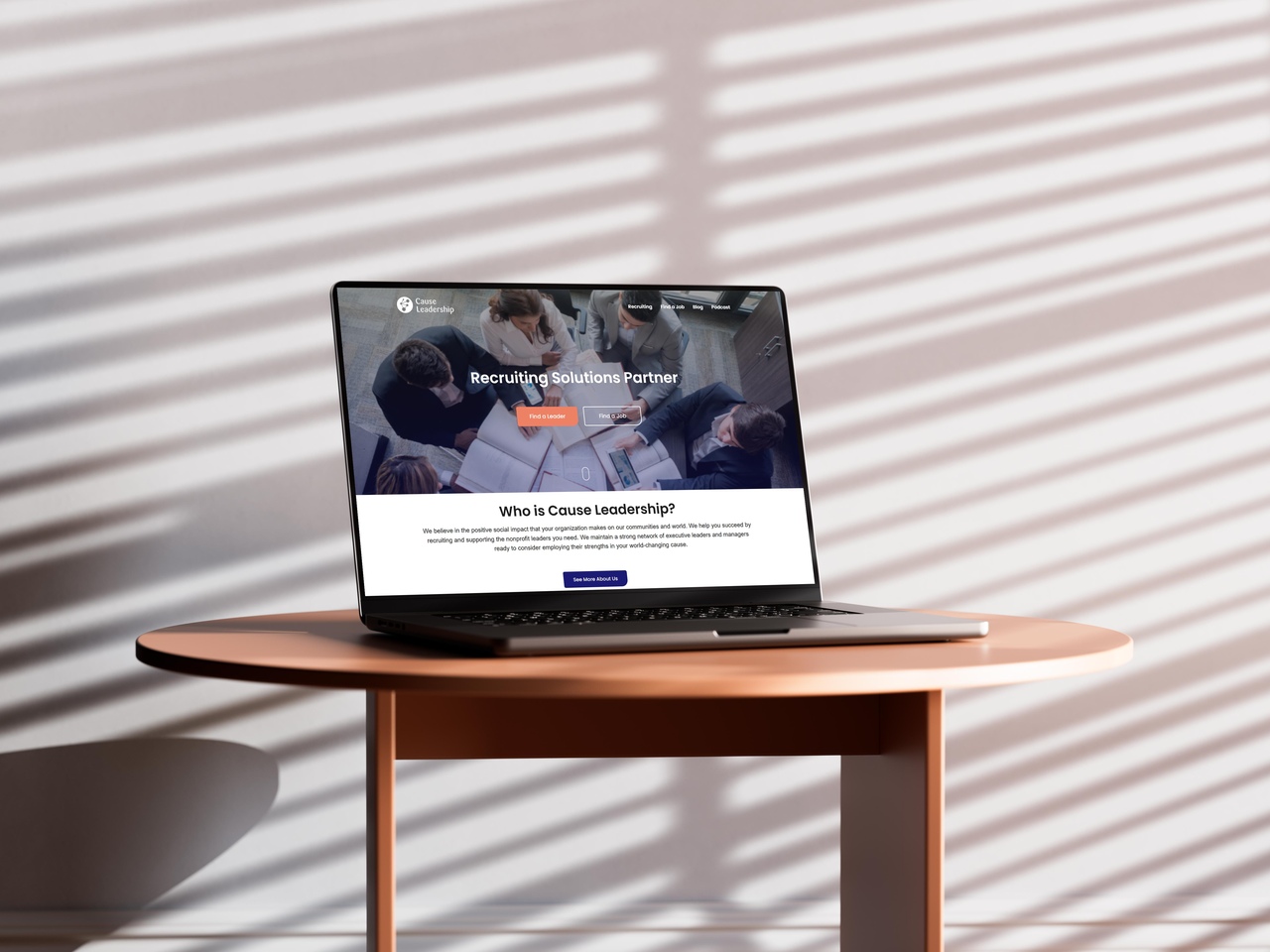
The client knew their website needed improvement. While the technical infrastructure was sound, the experience felt cluttered, the messaging lacked clarity, and users struggled to find what mattered. Nuance partnered with the team to bring focus, simplicity, and alignment — without disrupting what already worked.
Improving a website doesn’t always mean rebuilding it — often, it means removing noise and restoring clarity.
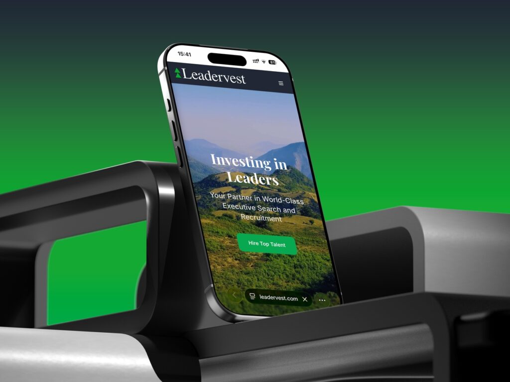
Branding & Website Design and Development for a North American Recruitment Firm
Ver detalhes →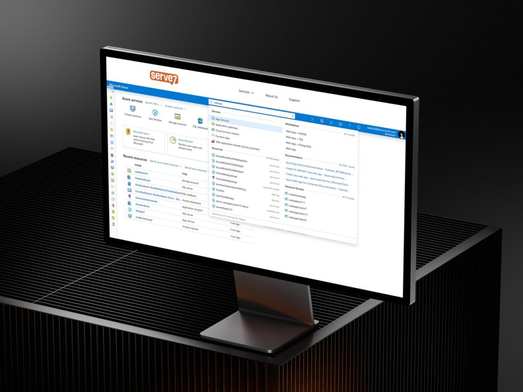
Software Development & Project Management for an Azure-Based Chat-Relay and Translation Bot
Ver detalhes →
Project Leadership for a Grant Making Program Development for a National Nonprofit
Ver detalhes →